Documentation Index
Fetch the complete documentation index at: https://docs.attio.com/llms.txt
Use this file to discover all available pages before exploring further.


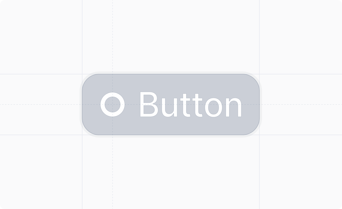
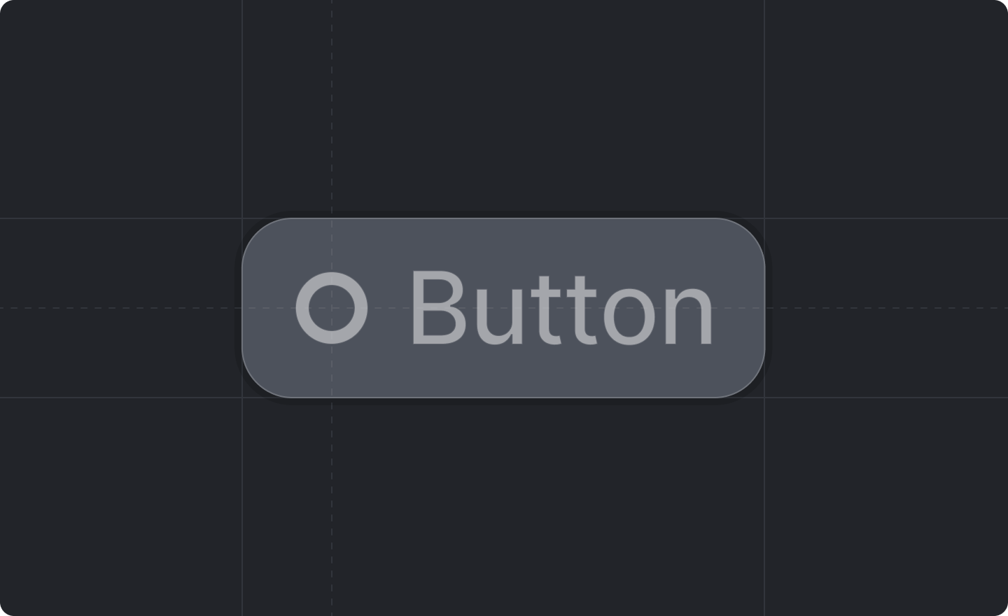
Example
Props
The text of the button.
A function that will be called if the user clicks the button.
The style of the button.Defaults to
"secondary".Whether or not the button is disabled.Defaults to
false.An optional keyboard shortcut that will fire the button.