Example
TypeScript
Props
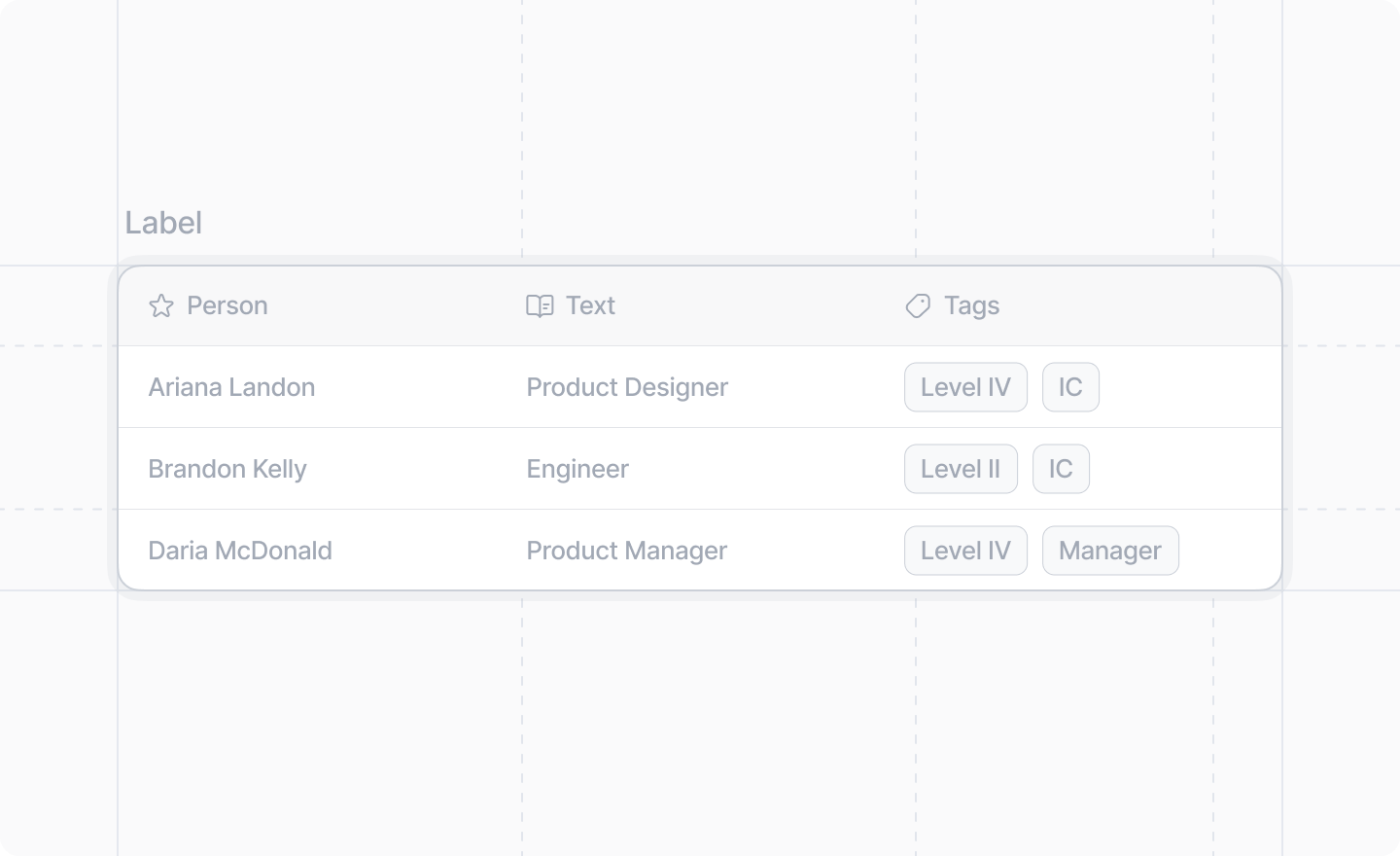
An optional label to display above the table.
The table structure. Must contain exactly one
<Table.Header /> and one <Table.Body />.<Table.Header />
The header row of the table. Contains the column headers.
Props
The header cells to display.
<Table.HeaderCell />
A single header cell in the table header.
Props
An optional Attio Icon to display next to the header text.
The text content of the header cell.
<Table.Body />
The body of the table containing all data rows.
Props
The table rows.
<Table.Row />
A single data row in the table body.
Props
The table cells for this row.
<Table.Cell />
A single data cell in a table row. Can contain text, links, badges, or avatars.
Props
The content of the table cell. Can be: - Plain text - Text with
<Link /> components - One or more <Table.Cell.Badge /> components (if using
badges, the cell must only contain badges) - One or more <Table.Cell.Avatar />
components (if using avatars, the cell must only contain avatars)<Table.Cell.Badge />
A badge component for use inside a table cell. Useful for displaying status indicators or categories.
Props
The text content of the badge. Only text children are allowed.
color
'amber' | 'blue' | 'cyan' | 'green' | 'grey' | 'lavender' | 'lime' | 'orange' | 'pink' | 'purple' | 'red' | 'yellow'
required
The color of the badge.
<Table.Cell.Avatar />
An avatar component for use inside a table cell. Useful for displaying profile pictures or organization logos.
Props
The name of the person or entity represented by the avatar. This is used for accessibility and as
a fallback when no image is provided.
The URL of the avatar image. If
null or undefined, a fallback representation based on the name
will be displayed.