import {DescriptionList} from "attio/client"
It can be thought of as analogous to the 
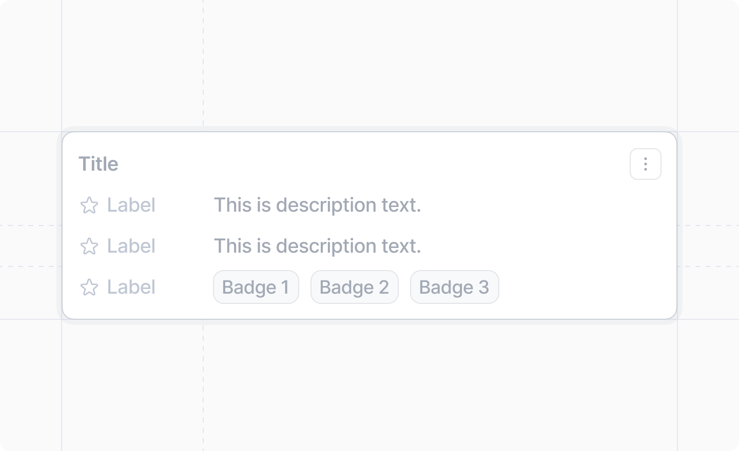
<dl>, <dt>, and <dd> HTML tags.

Example

TypeScript
import {DescriptionList, Badge, Link} from "attio/client"

export function InformationDialog() {
  const handleEdit = () => {
    // Handle edit action
  }

  const handleDelete = () => {
    // Handle delete action
  }

  return (
    <DescriptionList title="Cryptids of Cornwall">
      <DescriptionList.Item label="Beast of Bodmin" icon="Eye">
        A large feline inhabiting Bodmin Moor.
      </DescriptionList.Item>
      <DescriptionList.Item label="Morgawr" icon="GlobeHemisphereEast">
        A sea serpent.
      </DescriptionList.Item>
      <DescriptionList.Item label="Owlman" icon="Moon">
        A giant owl-like creature.
      </DescriptionList.Item>
      <DescriptionList.Item label="Categories" icon="Tag">
        <Badge color="blue">Folklore</Badge>
        <Badge color="amber">Cornwall</Badge>
        <Badge color="lavender">Paranormal</Badge>
      </DescriptionList.Item>
      <DescriptionList.Menu>
        <DescriptionList.Menu.Item label="Edit" icon="Edit" onSelect={handleEdit} />
        <DescriptionList.Menu.Item
          label="Delete"
          icon="Trash"
          variant="danger"
          onSelect={handleDelete}
        />
      </DescriptionList.Menu>
    </DescriptionList>
  )
}

Props

title
string
An optional title to display in the description list.
children
React.ReactNode
required
The <DescriptionList.Item />s and optional <DescriptionList.Menu /> with the information to display.
An <DescriptionList /> component can only have <DescriptionList.Item />s and an optional <DescriptionList.Menu /> as children.

<DescriptionList.Item />

An item with information.

Props

label
string
required
The label of the information.
icon
Icon
An optional Attio Icon.
children
React.ReactNode
required
The information corresponding to the label.
An <DescriptionList.Item /> can contain either text (including <Link />s), or <Badge />s, but never both.

<DescriptionList.Menu />

A dropdown menu for the description list, displayed as a three-dot icon button. It aligns with the title if provided, or with the first item if no title is set.

Props

children
React.ReactNode
required
The <DescriptionList.Menu.Item />s to display in the menu.

<DescriptionList.Menu.Item />

A menu item within a <DescriptionList.Menu />.

Props

label
string
required
The label of the menu item.
icon
Icon
An optional Attio Icon for the menu item.
variant
'primary' | 'danger'
The visual variant of the menu item. Use "danger" for destructive actions.
onSelect
() => void
required
The callback to invoke when the menu item is selected.